OUR NEW LOOK

The PDA Brand

Our brand reflects the heart of PDA—built by our students through collaboration, research, and creative vision. It’s a living identity that evolves with our community and celebrates the power of design to connect, inspire, and transform.

A Student-Led Rebrand

What makes the PDA brand refresh different? It wasn’t outsourced. It wasn’t top-down. It was student-led, faculty-supported, and research-driven. Our design students became their own clients, reimagining PDA’s identity through workshops, critiques, and collaborative decision-making.

Our Team

Our Rebrand Team consists of PDA students, faculty, and staff.

Gabriel Javeri

senior student designer

Gabriel is a second-year Graphic Media Design student with a strong focus on research, strategy, and creative problem-solving.

Zoe Jensen

senior student designer

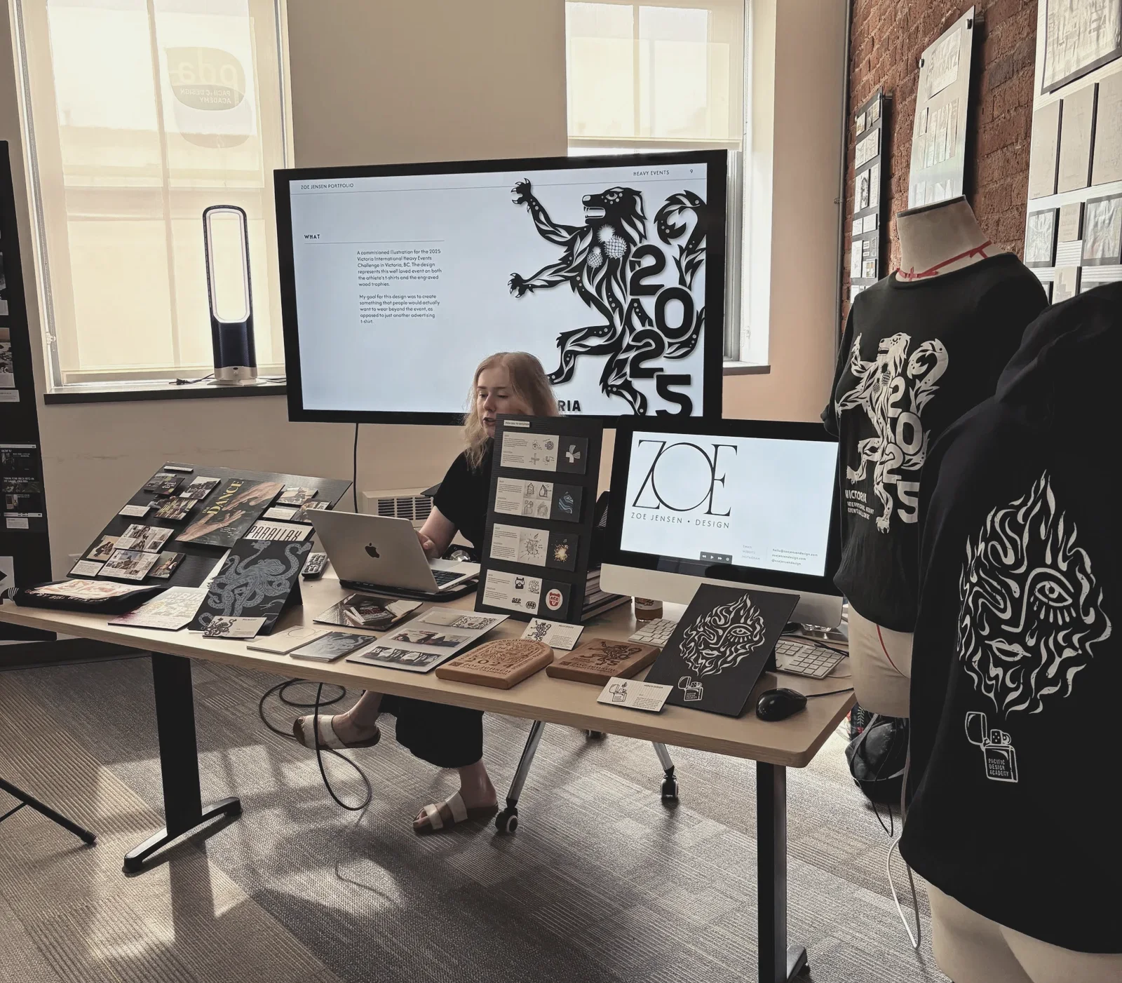
Zoe is a second-year student who excels in branding and illustration, bringing playful energy and sharp visual identity skills to every project.

Sofia Mairs

junior student designer

Sofia is a first-year design student with a keen eye for layout and illustration, and a thoughtful approach to visual storytelling.

Clare Talbot

senior student designer

Clare is a second-year designer who specializes in typography and UX/UI, creating user-focused work that’s both smart and beautiful.

Georgia Quirring

Project Manager

Georgia is a contemporary artist and project manager with a BFA focused on creative leadership. Her work blends video, performance, and storytelling.

Lynne Risk

Founder & Creative director

Lynne Risk is a multidisciplinary designer, with 15+ years of design experience across education, creative agencies, and government in-house teams.

Fast Track Rebrand

We rolled out a full brand refresh in just a few months—redefining typography, colour, and tone while building new brand assets and guidelines at a rapid pace. The compressed timeline demanded clarity, collaboration, and creative focus from day one.

Brand ResearchMarket ScanLogo DesignTypographyColour PaletteLayoutWebsiteSwag

PDA Brand Highlights

Below are some of our favourite creative accomplishments with the refreshed PDA brand.

Typography

The PDA brand typography brings together expression and accessibility through a purposeful pairing of Bely Display and Lexend. Bely Display, a bold and sculptural serif by French type designer Roxane Gataud, was selected to give the brand a distinctive voice—one that feels both artistic and editorial. Roxane designed Bely when she was still a design student, so it seemed a perfect fit for a design school. It anchors the brand in creativity and confidence, echoing the energy of our student body. Lexend, a humanist sans-serif designed by Dr. Bonnie Shaver-Troup, is based on her groundbreaking research into reducing visual stress and improving reading comprehension. This pairing reflects PDA’s commitment to both aesthetic excellence and inclusive, evidence-based design—ensuring that every word we share is clear, considered, and accessible to all.

Colour Palette Refresh

The refreshed PDA colour palette is vibrant, adaptable, and intentionally designed to evoke clarity, optimism, and energy. At its heart is a brighter green, a nod to renewal, growth, and creative momentum. Complementing it is a versatile teal gradient, created by design students to bring subtle movement and dimensionality to digital and print applications. These colours were carefully tested in real student projects to ensure usability across diverse contexts—from bold website headers to delicate UI details and printed collateral. The refreshed palette balances legacy and innovation, offering a system that’s future-ready but still grounded in PDA’s original visual DNA. It's a palette designed to energize, not overwhelm—just like our students.

Transitional Logo

Our logo refresh honors PDA’s visual legacy while evolving its form to reflect who we are today: a bold, interdisciplinary design school grounded in creativity and community. The new wordmark refines the original letterforms for improved visual balance, scale adaptability, and clarity across platforms. These subtle but meaningful changes ensure the logo feels at home everywhere—from small mobile screens to gallery walls and print campaigns. The updated letterspacing and alignment create a confident rhythm, while the simplified structure allows the PDA name to stand tall on its own. This evolution is about more than aesthetics—it’s a signal that PDA is growing, responding, and leading with purpose in a changing design landscape.

Bauhaus Iconography

The PDA icon system is a modern tribute to Bauhaus principles, adapted to tell the story of PDA’s programs and values in a fresh, friendly way. Developed by students and refined through iterative workshops, each icon is built from a common set of geometric shapes—circles, squares, lines, and triangles—that symbolize openness, structure, and play. These icons represent each of PDA’s design disciplines (fashion, graphic media, interior, digital, and film), while also acting as modular visual metaphors for concepts like collaboration, process, and transformation. Their clean lines and modularity ensure consistency, while their flexibility invites creativity and customization in promotional materials, student work, and wayfinding. This visual language reinforces the idea that design is for everyone—and always evolving.

Meet Paddy

Meet Paddy, the official mascot of PDA and a proud product of our student-led rebrand. Created by Zoe Jensen, a rebrand student and soon-to-be graduate, Paddy was designed using the same geometric forms found in our icon system. Paddy embodies the joyful, experimental, and inclusive spirit of the PDA community. With their round eyes, playful proportions, and ever-adaptable pose, Paddy brings warmth and approachability to our communications—especially for prospective students and community partners. As a nonbinary, non-verbal character, Paddy also symbolizes PDA’s core values: curiosity without judgment, presence without ego, and creativity without limits. Whether popping up in social media posts, walking across the bottom of a website page, or cheering students on during orientation, Paddy reminds us that design should be fun, accessible, and full of heart.

Feeling inspired?

Explore
Drag